From Observation to Judgment
In this post, I want to talk about how to turn observation data into judgment.
I have been running GA4 and Search Console on this blog myself for a few years now. I look at which queries bring visitors in and revise post titles and descriptions to match, over and over. Yet it turned out that having watched the data for a long time and making good decisions with that data are different problems. As I will cover later in this post, I nearly reached two opposite conclusions about the same metrics of the same post within two months.
The earlier browser observation post looked at the performance information browsers produce, and system observation looked at the errors, logs, and traces systems leave behind. Once enough of this information accumulates, how the service behaves becomes far more visible than before. But what to fix first, whether that problem actually matters to users, and whether the experience improved after the fix are still different questions.
The core of this post is not forcing data together at the user level, but checking the same product hypothesis across different units of observation. And more data sources do not automatically make judgment better. The moment you put numbers with different samples and aggregation rules on one chart, unrelated changes can be bundled into a plausible story. What the last stage of observation needs is not more dashboards but the ability to tell what each dataset saw and what it could not see.
The three layers this blog observes
Rather than starting with abstractions, it is better to lay out my own case first. This blog has ended up observing at three layers.
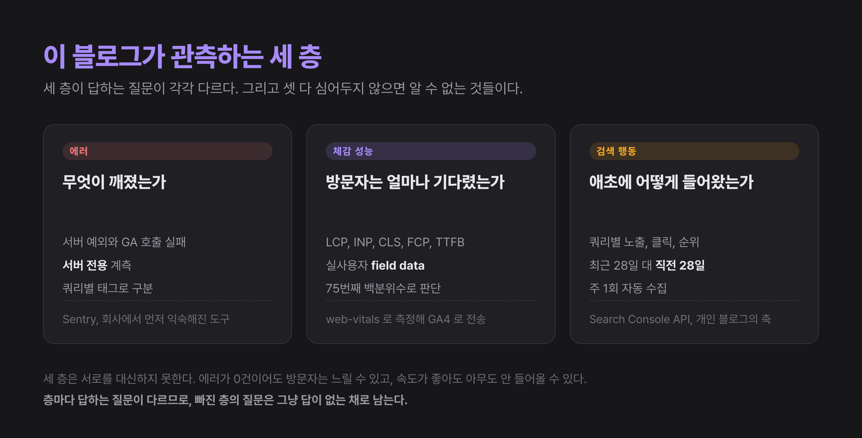
The first layer is Sentry. Server-only instrumentation catches exceptions and GA calls that fail silently. The second layer is real users' perceived performance. Web Vitals measured in the browser are sent to GA4 and accumulated. The third layer is search behavior. Search Console data is collected automatically every week, comparing the last 28 days with the previous 28. Each layer answers a different question. What broke, how long did visitors wait, and what queries brought them here in the first place.
The three layers cannot substitute for one another. Zero errors does not mean visitors are not slow, and a fast site can still be one nobody visits. The first two layers were covered in the previous two posts, so the weight of this one is on the third layer and on how to read the three together.
To be honest, GA4 on this blog is not used deeply as a behavioral analytics tool. It is closer to a store of page views and web_vitals events. So the GA4 part of this post combines the constraints I have confirmed while operating it with design criteria verified against official documentation. I will distinguish, section by section, where experience ends and research begins.
Different units of observation
It is tempting to call browser RUM, Sentry, GA4, and Search Console all user data, but their actual units of observation differ.
| Layer | Representative data | Unit of observation | Question it mostly answers |
|---|---|---|---|
| Browser experience | LCP, INP, CLS, resource timing | Page visits and interactions | What did users wait for, and how long |
| System state | error, span, trace, log, profile | Events and requests | Where did something fail or slow down |
| Product behavior | GA4 event, session, key event | Actions and sessions | What did users do inside the service |
| Search intent | query, impression, click, position | Search impressions | What problem brought users here |
Even when it looks like one person's journey, not every layer observes the same user. Ad blockers can block GA and Sentry requests, and the analytics sample changes with privacy consent state. Search Console provides aggregated data about search results, not individual users. CrUX is field data from Chrome users who meet certain conditions.
So it is normal that the numbers of the four layers do not match exactly. The task is not to eliminate the differences but to record which sample and which question each number answers.
The GA4 event model
A GA4 event models a user interaction as a name and parameters. Google's event setup documentation distinguishes events the SDK collects automatically, enhanced measurement you enable in settings, recommended events with prescribed names and parameters, and custom events the service defines itself. The same word event differs in who owns its meaning and schema.
At first you want to send as many clicks and screen transitions as possible. But more events do not mean deeper user understanding. If you turn implementation locations into names, like button_click, button_click_2, and main_button_clicked, the analytical meaning collapses whenever the code changes.
A good event expresses the user's intent rather than a DOM incident.
gtag('event', 'article_reference_open', {
  article_slug: '260916',
  reference_type: 'specification',
  link_position: 'body',
})
This event records the fact that a user opened a reference in an article, not which button component was pressed. Even if the UI changes, the analysis question survives.
Before designing events, it helps to write down the following first.
- Which user behavior are you trying to understand
- What occurrence counts as that behavior having happened
- What is the minimum set of parameters the analysis needs
- What decision will you make when this number changes
- How will you verify duplicates and omissions
If the last two questions have no answers, the event easily becomes dashboard decoration. (This is also why this blog's GA4 stays a store. The only event that can answer question 4 is still web_vitals.)
The gap between collection and reporting
With the GA4 Measurement Protocol, you can send events from servers or offline systems outside the browser. But Google's Measurement Protocol reference states an important limitation. The collection endpoint returns 2xx when it receives an HTTP request, and does not return an error status even when the payload is malformed or the data is never processed.
HTTP 2xx means the request was received; it is not evidence that the event landed correctly in the report you wanted. The failure hiding inside a success response, which the system observation post covered, exists in analytics collection as well. Just as this blog had empty statistics hiding behind 200 responses, in analytics a successful send is not the same as successful processing.
So before deploying, check payloads with the validation endpoint or the Event Builder, and after deploying, verify the event pipeline in at least three stages.
- Sending: did the client or server send the request
- Collection: do the event and its parameters appear in Realtime and DebugView
- Analysis: can it be queried by the intended dimensions in final reports and the export schema
Even with tests on the code that sends the data, if collection settings or a custom dimension registration is missing, the value cannot be used at the analysis stage. Analytics is also an operational system that needs post-deployment verification.
Questions raw events open up
GA4's default reports are good for quickly checking frequently asked questions without handling raw events directly. But limits appear when you want to combine events and parameters freely or join them with other data.
BigQuery Export lets you export GA4's raw events daily or via streaming. The daily export for a standard property has a limit of one million events per day. Streaming export is fast but best-effort, does not include attribution for new users, and attribution for existing users can take time to be fully processed. That is why same-day analysis should use events_intraday_* and stable daily analysis should use the finalized events_* tables.
With access to raw events, questions like these become possible.
- Did sessions that experienced slow LCP move to the next page at a different rate
- Did the completion rate of key actions change in sessions that hit errors after a specific release
- Does reading depth inside a landing page differ by search query type
- Do interaction patterns for the same feature differ between mobile and desktop
But raw data hands you, along with interpretive freedom, the responsibility to handle duplication, late arrival, sessionization, and timezones yourself. Being able to write SQL does not guarantee a correct user model.
The intent search reveals
GA4 looks at what users do after they enter the site. Search Console shows how, before that, they were exposed and clicked through which queries and search results.
The Search Analytics API can aggregate clicks, impressions, CTR, and position by dimensions like query, page, country, device, and search appearance. But the official API documentation explains that it does not guarantee all rows and returns top rows subject to internal limits. The sum of small queries may not exactly match the overall totals.
This constraint is not a warning that lives only in documentation; it is a phenomenon visible every week in my CSVs. In the last-28-days data collected on September 11, total clicks in the page dimension are 47, while total clicks in the query dimension are 8. Same site, same period, yet most of the clicks are invisible in the query dimension. Rare or anonymized queries are simply not returned as rows. If you try to explain all traffic with query data, you end up filling that gap with imagination.
Average position is not a simple leaderboard either. It is a value aggregated across impressions from multiple queries, devices, countries, and search appearances. When the query mix changes, the average can move even if each individual keyword's rank stays the same.
The ranking fell, but clicks rose
I ran into this property of average position in this blog's actual data. Can Biome replace ESLint and Prettier? is a post from December 2024, and for a long time it had oddly few clicks relative to impressions. So last June I rewrote its seoTitle closer to the shape of actual search queries. It is a comparison-style title starting with "Biome vs ESLint vs Prettier".
In the 28-day comparison collected in early August, the post's numbers moved like this. Impressions fell 11%, from 230 to 204, and average position slipped from 8.9 to 11.6. On those two metrics alone, the post got worse. But clicks rose from 2 to 13, and CTR went from 0.87% to 6.37%.
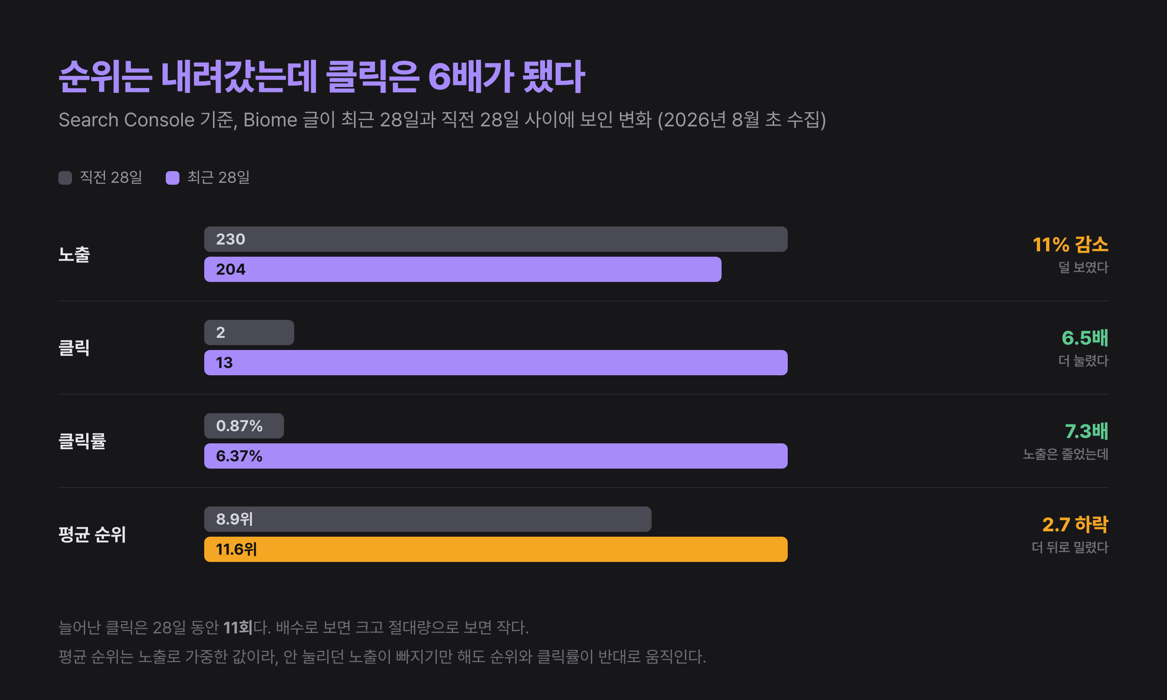
Honesty requires letting the air out first. These numbers do not prove the effect of the title change. Average position is an impression-weighted average, so if impressions that appeared high but were never clicked simply drop away, position worsens and CTR rises mechanically. The query mix and seasonality can differ between periods, and the absolute increase in clicks is 11 over 28 days. Large as a multiple, small in absolute terms.
Even accounting for that, something remains. If you treat ranking as the outcome, this is a post that needs fixing; if you treat actual traffic as the outcome, it is a post that improved. Which outcome metric you choose changes the conclusion drawn from the same data. Had I been looking only at the ranking drop, I would have torn apart a post that was starting to work.
The numbers requeried in September
While putting this series together, I queried the same post's current state again. When writing about past work, my rule is to check whether that state still holds, and once again I was glad I did.
In the last 28 days collected on September 11, the post has 185 impressions, 6 clicks, a 3.24% CTR, and an average position of 20.8. Clicks came down to less than half of the 13-click peak, and average position slid all summer, 8.9 → 11.6 → 14.5 → 20.8 in order of collection. So the reversal narrative, ranking fell but clicks rose, was sharpest in the early-August comparison window, and the following window shook that narrative again.
This requery does not overturn the previous section's conclusion. Clicks are still above the pre-change 2, and CTR is still above 0.87%. Five of the six search queries that recorded clicks on this blog are also comparison-style queries for this post, like "eslint vs biome". But one lesson was added. Not only the choice of metric but the choice of comparison window also changes the conclusion. Complete a narrative from a single 28-day comparison, and the next 28 days will break it. And I still do not know why average position keeps sliding. The mix of queries the post appears for may have changed, or competing documents may have multiplied. Until I check, it stays unresolved.
Connections that start from a hypothesis
When people talk about connecting data, the first thought is to unify user IDs and session IDs. Of course, shared dimensions like trace id, release, route, and timestamp make analysis easier. But joining all data at the individual level should not become the goal.
Search Console queries cannot be linked to individuals and must not be. GA events for users who did not consent may not exist. Many errors in Sentry events have no need to identify a user.
So it is better to decide the hypothesis's unit of observation first.
| Hypothesis | Appropriate unit of observation |
|---|---|
| Payment errors increased after the new release | Error rate and key event completion per release |
| Mobile users start reading articles late | LCP distribution and engagement events per device |
| The landing page does not match a certain search intent | Impressions and CTR per query cluster, behavior per page |
| A fallback repeats invisibly to users | Events per fallback reason and the share of affected sessions |
With the hypothesis first, there are many cases where aggregate-level data answers well enough without personal identifiers. The earlier Biome post case is one of them. What I needed was not the individual users who clicked that post, but a 28-day comparison of query mix and clicks. Precision of observation and precision of user tracking are not the same thing.
The limits of correlation
The most common mistake when connecting observation data is reading two values that moved in the same period as cause and effect.
Say conversion dropped in the week LCP got worse. Performance may be the cause, but campaign traffic, price changes, inventory, seasonality, and device mix shifts are also possible. Compare overall averages, and an increase in mobile traffic alone can make the two values move together. This is also why I did not immediately tie the seoTitle change and the click increase together as cause and effect. The fact that two events followed each other in time is not enough.
Narrowing the question in the following order reduces hasty conclusions.
- Did they change in the same time window
- Does the relationship remain within the same user environment and route
- Does it align with a specific release or change point
- Can the ordering of errors and performance be confirmed at the event level
- After a fix or an experiment, does it return in the expected direction
Observation data is strong at narrowing candidate causes. Confirming causality additionally requires controlled experiments, natural experiments, or reproducible changes.
Distributions and ratios
The more you compress systems and user experience into averages, the more the important cohorts disappear.
An average LCP of 2 seconds can coexist with some mobile users experiencing 8. A low overall error rate can be concentrated in one specific browser that received the new release. A rising CTR with sharply falling impressions can mean the composition of reached users itself changed. The Biome post's 6.37% CTR was exactly this case.
So combinations like the following are needed.
- Performance: p75 and p95, not just the median
- Errors: affected users and session share, not just event counts
- Behavior: completion rate against eligible users, not just event counts
- Search: impressions, clicks, and query mix, not just CTR
- Deploys: windows before and after a release and during staged rollout, not just the whole period
The denominator of every ratio should be stored too. 100 checkout errors alone look like a big problem, but the judgment differs depending on whether it is 100 out of 100 attempts or 100 out of a million.
Consent and data quality
The deeper you go into user observation, the harder it becomes to treat privacy and consent as a legal checklist bolted on afterward. What you are allowed to collect determines which analyses are possible.
Google's Consent Mode official documentation describes how tags and SDKs adjust their storage and transmission behavior according to the user's consent state. Basic mode blocks tags before consent. Advanced mode loads tags with default consent states and, while consent is denied, sends cookieless measurement signals that can be used for more specific modeling.
What matters here is not treating modeled data and observed data as the same thing. Depending on configuration and eligibility, behavioral or key event modeling may be applied to reports, so you should not assume the number on screen is always a simple sum of directly observed events.
Observation design should include these questions.
- Is this data truly needed for the decision
- Can the question be answered at the aggregate level without identifying individuals
- What stops being collected when a user declines
- Can we operate deletion and retention periods
- Do SDK defaults match our service's policy
Collecting less data can reduce analysis opportunities. At the same time, it reduces unnecessary noise and risk. Good observation is closer to purpose-fit minimal collection than to maximal collection.
Defining failure and success
What to collect minimally ultimately depends on how the service defines success and failure. Tools compute error counts, latency, sessions, conversions, and CTR, but they do not decide which value is the service's failure and which is its success.
Returning HTTP 200 can still be a failure if the core data is empty. Conversely, even if an external API failed, if a fallback appeared quickly and the user achieved their goal, the service may have succeeded. Even if search position drops, if clicks from the users you want increased, the product outcome may have improved.
This judgment requires explicit sentences between technical metrics and user outcomes. The sentences I actually set for this blog are these.
- Users should be able to find the article they expected from search results.
- An article's main content should appear within the time set at mobile p75.
- Reading the article body must not be delayed even if auxiliary statistics fail.
- A scheduled collection job not running counts as an operational failure.
Once these sentences exist, the necessary metrics, alerts, and events follow. Conversely, if you start by turning on a tool's default dashboards, it is easy to mistake what is measurable for what is important.
The engineer's role in turning observation into judgment is not to become the person who knows the data best. It is to become the person who translates user expectations into conditions the system can verify.
What should alerts be attached to
Once the definition of failure exists in sentences, the next question follows immediately. Where do you attach alerts?
The alerting philosophy document Rob Ewaschuk wrote in Google's early SRE days states firmly that alerts paging a human must be urgent, important, actionable, and real. And it recommends alerting on symptoms, not causes: on outwardly visible signals like 500 responses or user-visible errors.
Yet there is a subtle tension between this principle and what I experienced. As covered in the system observation post, this blog's failure was not a 500 but a 200 response with empty statistics. Symptom-based alerting stands on the premise that failure surfaces outwardly, and a failure classified as success breaks exactly that premise.
So I do not think this principle needs to be rebutted. Rather, I arrived at the conclusion that defining what counts as a symptom is the genuinely hard part of this work. On this blog the symptom was not a status code but "the statistics query function returned its default value", and that could only become a symptom by planting instrumentation by hand. This is why the previous section argued for defining failure and success in sentences first. Only with those sentences is it decided which symptoms to alert on.
The advice the same document adds is also worth keeping. Lean toward deleting noisy alerts, because over-monitoring is a harder problem to solve than under-monitoring. For reference, the Google SRE book includes monitoring failure itself in its list of triggers for writing a postmortem. The machinery that collects observation data stopping quietly is also a failure. For this blog, the weekly Search Console collection not running in some week belongs on that list.
Translation between data sources
Once the alerts are in place, what remains is translating user expectations into the different query languages and schemas of browser RUM, Sentry, GA4, and Search Console. The role AI can take at this point is less generating conclusions and more translating one question into a verifiable form for each data source.
For example, a flow like this becomes possible.
- Convert a natural-language question into each system's API queries and SQL.
- Build transformations that align different timezones and dimensions.
- Find segments whose distributions diverge and unexpected counterexamples.
- Gather related releases, code paths, and official documentation together.
- Propose the next hypotheses to check and candidates for additional instrumentation.
This is also why OpenTelemetry's semantic conventions matter. If the same meaning is sent under different attribute names per service, even AI must guess the schema first. Keeping shared names, units, and stability makes signals easier for tools and people to connect.
Even with AI assisting the analysis, the verification steps do not shrink.
- Check that generated SQL handles duplicate events and timezones correctly.
- Check whether the API returns all rows or only top rows.
- Check that averages and percentiles, user counts and event counts are not confused.
- Distinguish modeled data from directly observed data.
- Do not attach excessive explanations to chance variation in small samples.
In short, AI's strength lies in turning questions into executable queries and widening the axes of comparison. The responsibility for checking which sample and aggregation rules produced a result remains as it was.
The feedback loop as a product capability
When the cost of turning questions into queries drops, the time between observation and the next change can shrink too. What matters then is not raising generation speed alone.
The 2025 DORA report published by Google Cloud, based on a survey of about 5,000 technology practitioners worldwide, summarizes that AI adoption showed a positive relationship with software delivery throughput and product performance, and a negative relationship with delivery stability. DORA explains the mechanism in a separate insights article like this. Time saved in the generation stage is reallocated to verification overhead, and the speed at which code requiring review is produced itself goes up. As the report's summary puts it, AI amplifies what a team already has rather than fixing the team. (DORA's ROI of AI-assisted Software Development report, updated in April 2026, also tackles head-on the problem of managing the early productivity dip after adoption.)
The evidence I take more seriously is something else. A study METR published in 2025 randomly assigned whether AI use was allowed across 246 real issues for 16 experienced open source developers, and on issues where AI was allowed, completion took 19% longer. Yet the developers expected beforehand to be 24% faster, and even after experiencing the actual slowdown, they believed they had been 20% faster. I cited this study in AI Frontend Engineer as part of a productivity discussion, but in the context of this post it reads differently. It is evidence that perception cannot substitute for measurement. If perception cannot be trusted, you have to measure, and as the earlier Biome post case shows, even a value measured once has to be measured again with a different window.
Faster generation means more change. Even if defects occur at the same rate, the absolute count grows, and code to review and user impact pile up quickly. If observation is slow at that point, a team raises only its deployment speed, not its learning speed.
A fast feedback loop is the ability to link the following steps tightly.
- Deploy a change.
- Observe what happened to the system and the users.
- Find the gap between expectation and reality.
- Narrow the causal hypotheses.
- Verify with the next change.
AI can greatly help the exploration in steps 3 and 4. But it cannot start if the signals needed in step 2 are missing or not connected to the release information in step 1.
So the foundation of an organization that uses AI well needs not only tests but also observable systems and user-centered outcome metrics. The quality of the feedback loop, rather than generation capability, becomes the bottleneck.
Turning observation into judgment
Folding the three posts of this series into a sentence each goes like this. Browser observation shows what users perceived, system observation shows where in the system that experience was produced, and GA4 and Search Console show what users did inside the service and with what intent they arrived. These signals are not one person's complete record but evidence illuminating the same hypothesis from different samples.
So the standard for connecting them is not data volume or the precision of personal identifiers. Choose the unit of observation that fits the hypothesis, record denominators and omissions, and reverify correlations with fixes or experiments. Users invisible due to privacy and consent must also be included among the analysis's limits. And a conclusion obtained from one comparison must be checked again with a different window. Just as my Biome post numbers told two different stories within two months, observation is not a single query but a matter of measuring again and again.
What observation covers is itself expanding. OpenTelemetry is organizing semantic conventions for generative AI and MCP calls in a separate repository. The more execution we hand over to AI, the more that execution also becomes an observation target under the same principles.
AI lowers the cost of starting this verification, but it does not set the criteria for success and failure. Deciding in sentences which experience to protect, collecting the needed signals, and confirming results with the next change remain the engineer's work. When this cycle is short and accurate, observation becomes a product capability rather than a dashboard. I hope readers of this post also pick one metric in their own service, write down in a sentence what will count as the outcome, and requery a conclusion they once reached with a different window. In my experience, the second query teaches more than the first.